PREOH ANALYTICAL TOOLS
TREND ANALYSIS AND MOVING AVERAGES:
Are you more interested in a trend analysis for your investment? Go to the Preoh charts and graphs. Some are very straightforward, and some use algorithms not found in any other Real Estate website. They include a graph analysis of your general price range in the areas you are interested in.
When you are signed up as a Preoh Buyer, you can access Preoh University to gain a complete understanding of the significance of the market statistics offered exclusively by Preoh.
There are eight graphs in all, each offering a different viewpoint of the market:
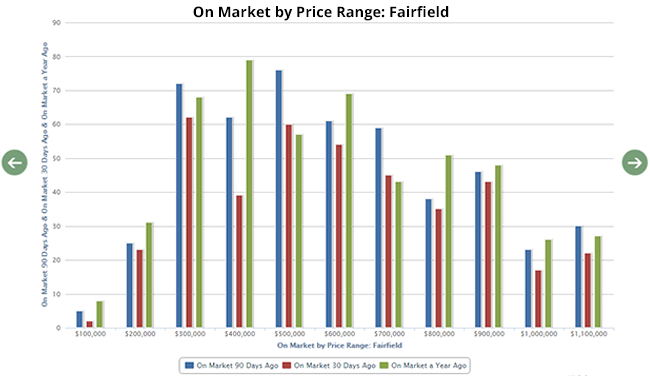
On Market by Price Range, and On Market by Price per Square Foot: these identify the number of homes in the listing price range that were on the market 30 and 60 days ago, and those that are still on the market after a year.
Sold 30 day Period by Price Range, and Sold 30 day Period by Price per Square Foot: These are broken down to show the number of sales in your general price range in the most recent 30 days, 90 days ago, and one year ago.
Months of Inventory by Price Range, and Months of Inventory by Price per Square Foot: This analysis looks at properties that were on the market 30 and 90 days ago, and sold 30 and 90 days ago by price range to project a 90 day inventory, and overall months of inventory.
Houses Sold per Week Moving Average: today to one year ago: This gives you a snapshot of 14 day, 30 day, and 90 day moving average of home sales. Though this is a lagging indicator, as prices were typically established 45 days prior to close, this tells you where the market activity is.
Number of houses on the market moving average today to one year ago: This gives you a snapshot of 14 day, 30 day, and 90 day moving average of number of homes on the market.